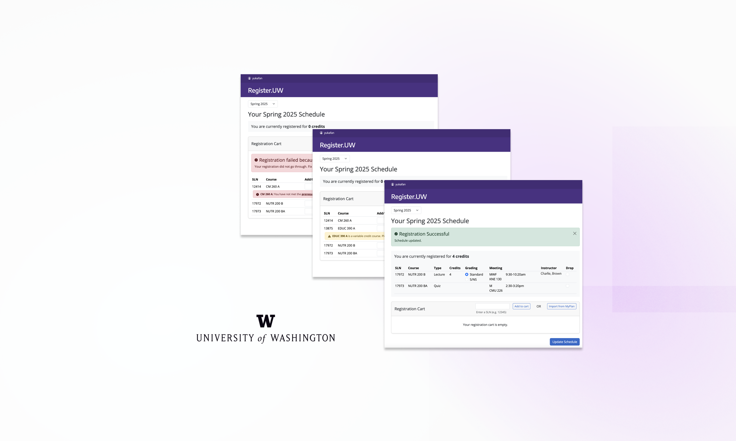
UW Registration Portal Design
Work Project: designing a new course registration page for UW students
Contributions
Research: Conducted workflow analysis and page flow, concept testings, user interviews and usability tests
Design: Created mid fidelity prototypes that contribute to the new portal, impacting 60k+ UW tri-campus students
Timeline
Oct 2024 - March 2025
Team
2× UX Designers
2 x Senior Designers
1× Design Manager
My Role
• Design
• Research
PROBLEM
Course registration is stressful !!
UW's course registration system hadn't been updated in 20 years. Students struggled with a confusing interface that created stress during registration periods.
As part of the UX team at UW-IT, our goals were to:
Design an intuitive interface
Supports quick registration
Improve error messaging
Meme found online. We are here to change it.
SOLUTION
Before
Original form fields-based interface
❌ Lack of accessibility due to empty form fields
❌ Unclear registration status and input fields
❌ Confusing messages and terminology
❌ …and many more
After
Our Cart based design
✅ Accessibility with clear interaction paths
✅ Clear status and where to start
✅ Intuitive interface with clearer messaging
✅ …and many more
DESIGN PROCESS
PREPARATION: Understanding the Complexity and Constraints
1. Workflow Analysis: Deep Diving into User Journeys
We had 5 iterations of workflow analysis to thoroughly understand the entire process—what are students' thought processes, potential pain points, information needs, and where they seek help at each decision point - just to know EVERYTHING that could be helpful to include on the page
Key Takeaways:
Clear confirmation + better error messaging -> reduce anxiety
Intuitive interfaces and input + easy error recovery -> fast registration
2. Page Flow: Designing to support the workflow
Then we had another 5 iterations on Page Flow to determine what to include on the page, how it integrates with other tools, and to align with stakeholders. Page Flow also helped confirm technical feasibility - it was a great place to start a conversation with the developers.
Goal: reimagined the registration experience to prioritize fast transactions and efficient error handling.
3. Identify Key Design Challenges
After the system mapping above, we identified clear scope and key design challenges that tie back to our project goals: 1. Design an intuitive interface 2. Supports quick registration 3. Improve error messaging
✍️
1. Information Hierarchy
⚠️
3. Error Prevention
⚡
2. Speed + Accuracy
Challenge 1: Improve information hierarchy ✍️
My Solution
Starts with only 1 input
I simplified the interface to just one button and one input field on the initial screen, creating a focused purpose and clearer narrative direction.
My wireframes introduced card-based visuals for selected courses that would appear in a pop-up, organizing complex information into scannable units.
Before
Final Design
After the hand off, The senior designer at UWIT maintained the core concept but evolved it by replacing the pop-up with an integrated cart section
Challenge 2: Improve both speed + accuracy ⚡
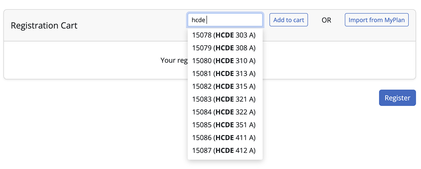
Users can either input sLns or course titles to find courses
My Solution
Flexible Input & Proactive Validation
We advocated for flexible input methods (both SLN codes and course titles) and pre-validation alerts to help users catch potential errors before submission.
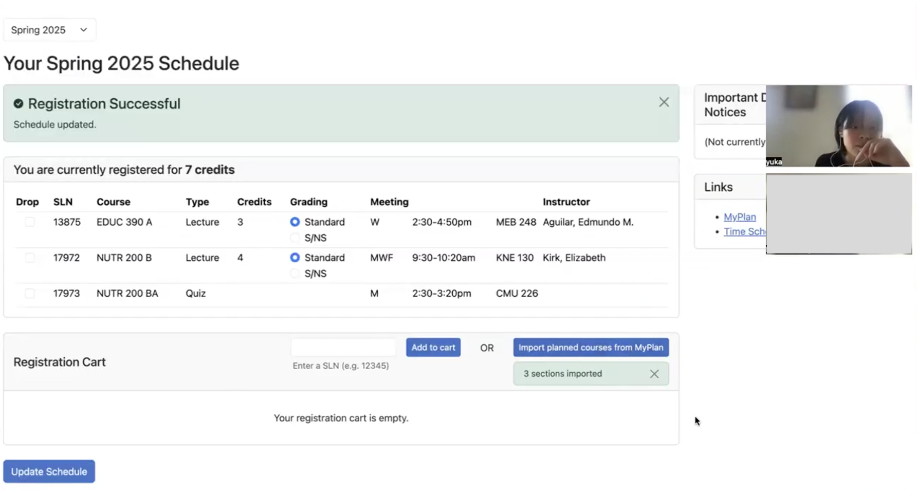
We also proposed integrating an "Import from MyPlan" feature that generates the course list with just one click from their planning tool—eliminating manual input entirely.
Originally, students had to prepare a list of SLN codes at hand and input manually.
Challenge 3: Improve Error Prevention ⚠️
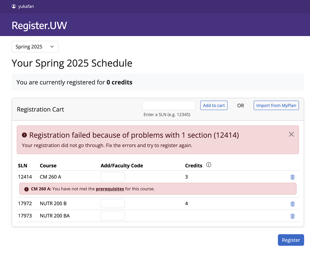
After the hand off, the senior designer created a comprehensive error system that distinguishes between potential errors and blocking errors.
My Solution
Preemptive Error Detection
I redesigned the error message to show potential issues even before the submission. Critical errors are shown in red, explaining what is the error + how to remedy.
Final Design
VALIDATION
We conducted remote moderated usability tests with 8 students from diverse academic backgrounds and years.
Each 50-minute session included 4 think-aloud tasks followed by a short interview, allowing us to validate our design decisions and gather qualitative feedback.
For testing, participants used functional prototypes coded by our engineers
Results:
96.8% Task success rate
Only one participant failed one task. Participants consistently described the new interface as "cleaner" and "more straightforward" than the previous system.
Despite mostly positive validations, we implemented some changes:
Before
Tested Interface
❌ Yellow alerts for required fields confused users when they persisted after input.
Before
Tested Interface
❌ Less prominent cart title.
❌ "Enter SLN" and "Import" buttons positioned together made students overlook the import button.
After
Final Design
✅ Subtle grey notes - less prominent but clearer to users.
After
Final Design
✅ More prominent cart title to pop out this section
✅ Separated buttons with clearer guidance.
NEXT STEPS:
1. Monitor the data and feedback after release
Following the April 2025 launch, our team will:
Track backend metrics during registration period
Analyze feedback submitted through the Registrar feedback system
Hold regular sync meetings between the Office of the Registrar and UW-IT to prioritize improvements
Implement targeted updates based on actual usage patterns
2. Future Exploration
My Finding
Bookmarking Link
Through user interviews, I discovered "power users" were creating bookmarks with pre-filled SLNs to speed up registration—allowing students to prepare ahead rather than frantically inputting SLNs at 6:45 AM or when receiving a open seat notification.
Ideation
Pre-Queue
To address complaints about students inputting sln and racing to register, I proposed a pre-queue feature. This allows students to add courses to a queue that automatically registers them when registration opens.
Oh no, technical constraint
Creative Workaround
Due to technical constraints, classes couldn't auto-register. So we are proposing a workaround inspired by the power users' bookmarking trick: direct registration links in notification emails.
Unlike the current system that requires sln manual input, my solution enables one-click registration on the link for newly available seats.


