Amazon’s comparison charts
UX research on Amazon’s comparison charts to uncover usability issues
Amazon sponsored project for the Usability Studies course at UW HCDE Master’s program
My Role
UX Researcher
Timeline
4 months
Jan - May 2024
Teammates
3 x UX Researchers
Contributions
Created the test session schedule, analysis boards, and a highlight reel. Drove team momentum by proactive communication and strategic planning.
OVERVIEW
Do you find comparison charts helpful when shopping for electronics?
What specific metrics do you focus on?
Are there aspects that confuse you, or do you find yourself not using comparison charts at all?
For this project, we collected usability data and user feedback to evaluate the performance of Amazon’s comparison charts and identify areas for improvement.
We started with these research questions:
What aspects of charts help/hinder the chart viewing/navigation experience?
What can we learn from third-party consumer electronics (CE) competitors to improve customer experience with Amazon’s comparison chart?
How does the device (mobile device vs. Desktop) impact the usability of Amazon’s device comparison chart?
METHODS
The target audience that we want to recruit was:
Users who are interested in buying Tablets in the past 6 months or in the future
Users aged 18-50, NOT in tech, research, or journalism
A mix of Amazon device owners and non-owners, desktop and mobile amazon users, and frequent and infrequent shoppers
We created a recruitment matrix to set up the screener on UserTesting.com, ensuring a balanced mix. Here are the final 12 participants we recruited:
TESTING
We conducted Remote Moderated Usability Study via Usertesting.com. The study consisted of a Think Aloud Session (30-40 min) followed by Likert scale rating questions to navigate:
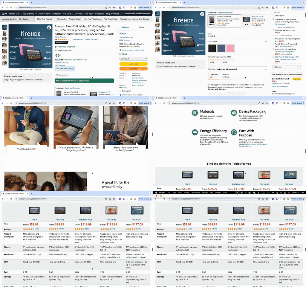
Amazon fire tablet chart
1-2 third party charts
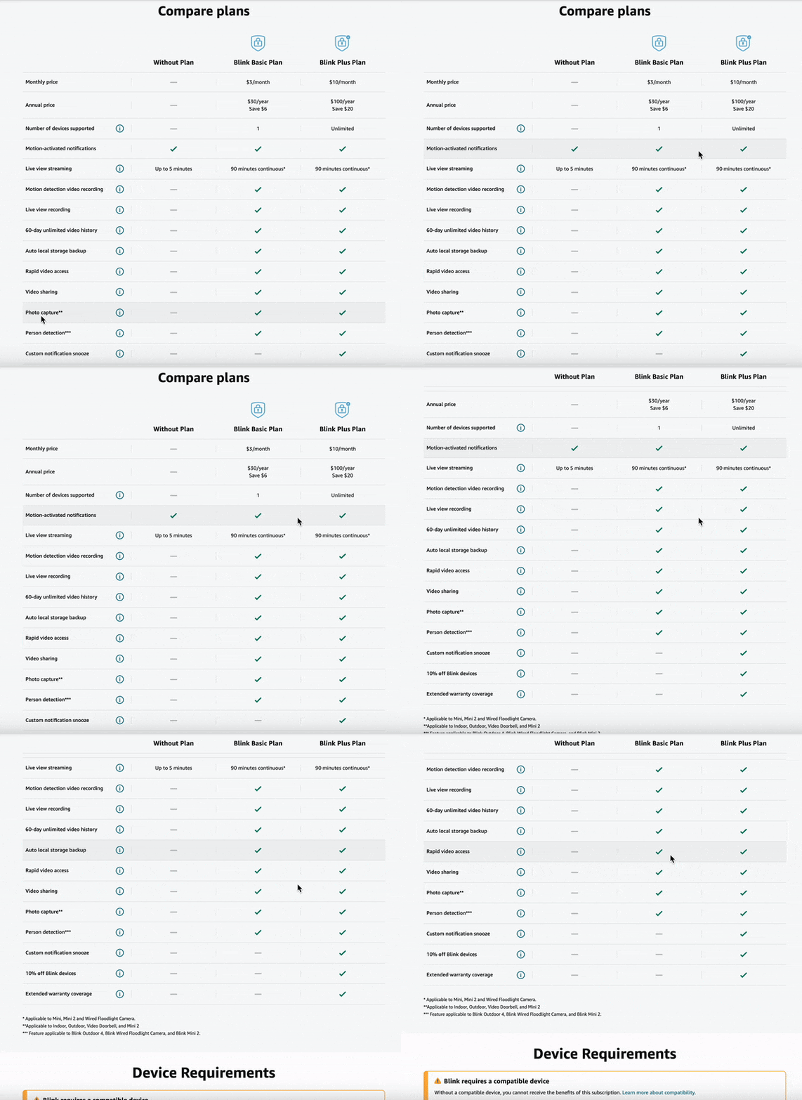
Blink subscription chart
The order of Amazon chart and third party chart was randomized for each participant to reduce order bias and priming. These tasks were followed by a post-task interview (10-15 min).
DATA ANALYSIS
For qualitative analysis, I set up boards to conduct bottom-up affinity mapping and thematic analysis to identify patterns and trends. For quantitative analysis, we used dot graphs to represent Likert scale ratings to compare distributions across participants’ ratings.
SEVERITY SCOPE
To help Amazon prioritize issues to fix, we used the Nielsen Norman severity rating scale for severity level rating 0-4 (minor to major). The ratings are determined based on Frequency, Impact, and Persistence.
HIGHLIGHT REEL
When presenting to Amazon designers, researchers, and leadership, I created a highlight reel based on usability test clips. This reel was categorized into findings that validated our research and showcased our insights in an engaging and direct way.
FINDINGS & RECOMMENDATION
Executive summary
Findings can be categorized into 3 themes:
Discoverability
Half of participants didn’t use the Amazon Fire Tablet chart without being prompted
Visual Scannability
The fire tablet chart includes helpful information, but too much text and scrolling create barriers
Information Quality
Users like to see the data that are relevant to their needs, and in an easy-to-understand format
Recommendation
Improving visual scannability and information quality are closely linked, as excessive text, complex data, and extensive scrolling negatively impact user experience.
The main recommendation is to prioritize simplicity by using straightforward data cells, such as real-world data or single values, incorporate checkmarks for binary data, and minimize scrolling by reducing columns or rows based on scrolling orientation.
SELECTED FINDINGS
We had many findings, but here I will highlight 3 that correspond to the 3 themes.
Finding 1:
Compared with competitors, Amazon Fire Tablet chart suffers from low discoverability due to chart placement far down the page
Only 50% of the participants found the Amazon Fire Tablet Chart by themselves, whereas 100% of participants found the charts for Amazon Blink, Apple, and Samsung organically.
3 out of 6 desktop users and 2 out of 6 mobile users mentioned that the comparison chart was too hard to find since it’s located far down the page.
“The Amazon chart took forever to find, which is crazy. Because it's under the ocean like 3,000 feet down, like there's no way I'm ever getting down there, especially on a phone.” [[P7, mobile user, non-owner of Amazon device, early in shopping journey]]
Where do they go?
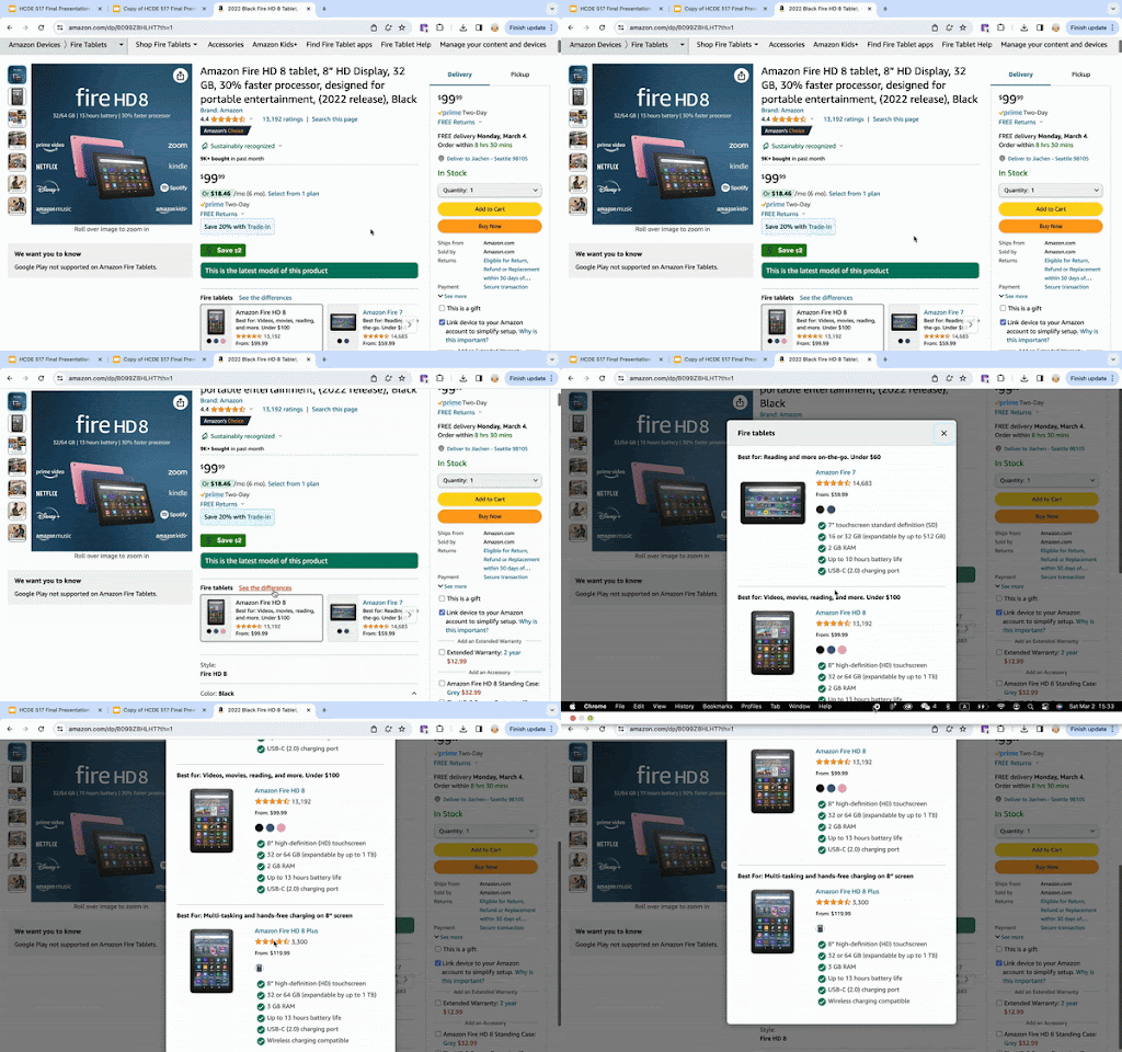
3/6 Desktop Users and 2/6 Mobile users interacted with “See the difference” link within Pick-A-Version
Interestingly, all participants who opted for the “see the difference” feature instead of the detailed comparison chart [Pilot 2, P5, P6, P7] were all of our early-stage participants.
Recommendation
We would rate the issue with a severity of 2 for the Desktop Fire Tablet chart and 3 for the Mobile version.
More testing is needed to determine the ideal placement to improve discoverability and enhance users’ engagement.
Consider A/B testing to see if users engage more with higher or lower placement on the page, and if adding a link higher up on the page that directs participants to the chart will enhance user engagement with the chart.
Finding 2:
Users want to easily find the differences across products
Amazon Blink Chart
5/6 Mobile users expressed a need to find specific differences in the charts, compared to 2/6 Desktop users.
Mobile users struggled more with navigating the charts due to the excessive information on smaller screens, making it hard to see differences.
Why Blink (mobile) is more scannable?
The Blink chart received higher ratings for Usefulness, Visual Appeal, and Ease of Use because users mentioned that it was scannable.
The key factor contributing to its scannability was that it made it easy to see the differences between products.
10/12 users mentioned that they liked the visual elements such as checkmarks, dashes and less text in the Blink Chart.
“Because my eyes were looking for differences, the green checkmarks [in Blink chart] make it very easy” – [ Pilot 1, mobile user, mobile user, owner of Amazon device, late in shopping journey]
Recommendation
We rate this issue with a severity of 2 for the Desktop and 3 for the Mobile.
We recommend using visual cues and reducing information in the chart to highlight key differences. Further testing is needed to determine the optimal number of models and categories of metrics to compare.
Finding 3:
Users prefer real-world implications of labels over technical terms
1000mAh
Up to 10 hours of battery life
3/6 Desktop and 2/6 Mobile participants mentioned that they preferred metrics in real-world context that they could easily understand, not technical terms
“ It's showing me 2.2 gigahertz 6 times up to 2 gigahertz. I'm not sure what that even means…”– [p1, Mobile, Owner]
Recommendation
We would rate this issue with a severity of 2 for both Mobile and Desktop chart.
We recommend providing real-world performance tests rather than just GHz, such as everyday tasks like web browsing and gaming.
Improve information clarity through:
Display information in a clear, easy-to-understand, friendly way.
Provide users with an intuitive way to access additional information through info icons, similar to those used in the Amazon Blink chart that received positive feedback.
REFLECTIONS
After 8 weeks of research, followed by a month of refining the final report and preparing the presentation, we presented our findings in person at Amazon to designers, researchers, marketers, and leadership. Our insights inform the future redesign of Amazon's device chart and enhanc its importance and visibility in decision-making for product development.
Looking back, here is the main things that I learned:
Scope down
If we were to conduct this study again, we would refine our focus. With various factors like desktops, mobiles, third-party charts, and subscription charts in play, we only scratched the surface on some areas. It was challenging to find a clear narrative during data analysis with so many elements involved. Scoping down would help us have a more structured approach and fewer areas to focus for data analysis and finding stories
Users have different opinions, and that’s okay
Although things seem scattered and varied, we learned that users can have very different opinions, and that’s okay. It doesn’t need to follow a pattern or clear trend. Having polarized views can also be a valuable finding. This is an example that made me realize that UX research can be really fun. It’s all about how you want to write the narrative and create a cohesive story with the data collected. Super fun.


