AR Hand Assessment Tool (H.A.T.)
Enabling patients of all abilities to assess upper extremity rehabilitation
Contributions
Working as the sole designer and leading 3 user tests and 1 usability testing with co-designers
Designing from 0 -1. Co-authoring a paper and presenting to local OTs and hand clinics
Timeline
Oct. 2024 - current
Teammates
1× Engineer
My Role
• Design
• Prototyper
• Research
PROBLEM
Measuring hands is hard
Measuring patient's hand functions such as range of motion (ROM) - how much each finger joint can flex or extend - is difficult.
Right now, clinicians measure it with hand-held goniometers, which have some problems:
Hand-held goniometers to measure ROM
SOLUTION
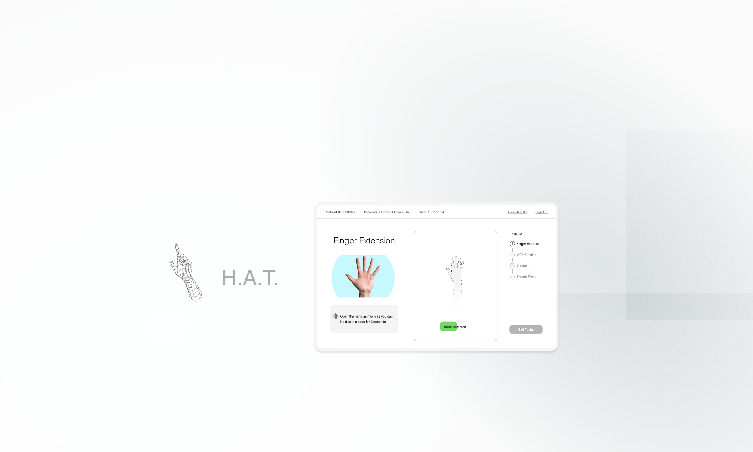
HAT is an AR tool for patients to assist with hand rehabilitation by recording and tracking their progress.
WHY AR?
Because we want to use Leap Motion Tracker:
1. Patients can record progress themselves
2. It can track and calculate the ROM of Joints
3. Incentivize insurance companies to continue paying for treatment since Leap is relatively cheap
The Leap Motion Controller is an optical hand tracking module that captures the movements of hands. It’s small, fast and accurate
DESIGN GOAL 🏆
Create an accessible AR product to guide patients to record different hand poses, and visualize progress to help them understand therapy outcomes
DEFINING SCOPE AND DESIGN REQUIREMENTS
✍️
1. Patient Info Entry
Input patient ID, provider, and date.
📊
3. Results Visualization
Use line/bar graphs to display progress, with session numbers and dates.
Allow users to select a date range to track metrics.
🧑🔬
2. Assessments
Select tasks for assessment.
Provide accessible instructions to guide patients through tasks.
Include interactive elements such as hand detection status, timer, completion feedback, etc.
DESIGN CHALLENGE 1
HMW guide patients effectively throughout the process?
Patients with neurodegenerative diseases or traumatic injuries often experience cognitive overload. It's essential to make the assessment process stress-free, easy to navigate, and accessible.
Solution: Intuitive multi-screen flow
Old
Old: Everything on one page
Info input, task selection, and assessment were all in one page, and we wanted to includ onboarding to explain each section.
Prototyping in Unity was a bad idea.
New: Separate the workflow
Break down the flow into multiple screens to reduce cognitive load.
Introduced a task list for progress tracking.
Focused on visually appealing elements with a clean and accessible layout.
Prototyped in Figma for rapid iterations.
New
Solution: Accessible Data Visualization
Big texts, Big buttons
How do i put data information of 5 fingers and 17 joints in one page while keeping everything easily readable?
I designed an interactive interface with large fonts and big buttons, allowing users to click through graphs and select date ranges.
During the usability test, the hand therapist found the data is accurate, and the patient navigated with no issues.
User commented it’s easy to navigate and liked the select date range feature
DESIGN CHALLENGE 2
HMW provide clear instructions for the recording tasks?
Guide users to perform tasks correctly while keeping the process simple and effortless - ensure the AR technology enhances, rather than complicates, the experience for users.
QUESTIONS ARISE…
Image or Video?
Participant is supposed to hold at one pose for 2s.
But they need have the correct hand orientation first (eg. palm facing towards the camera).
Which is more effective? Image or video tutorial?
Video Tutorial or…
Use images?
And how people interact with the Leap device? Where it should be placed - on the table or facing towards the users?
How do users engage with the skip button if there is one?
Use Test 1: Lego prototype
In User Testing 1, I used Lego and displayed tutorial images/videos on my laptop to test these ideas with 5 participants.
Key Findings
1) Images are more effective than video tutorials in reducing errors.
2) Remove “Skip” button for accessibility; voice control is out of scope.
3) Simplify language and update images for clearer instructions.
Participants tend to make mistakes at video tutorial (record pose starting with the hand orientation, or incorrect hand orientation)
Participants tend to make less mistakes at image tutorial
Solution: Intuitive & easy instructions
Images and minimal texts are better
User tests confirmed that participants made fewer mistakes with images. This approach helped them not only position correctly but also stays in the pose.
Later testing also revealed that users DO NOT READ text, so the finalized text instructions are minimal and to the point.
Solution: Gamified the experience
Old
Old: Multiple cues
Included a hand detection bar that changed colors.
A timer and “beep” cues to indicate detection and recording.
Too many cues confuse people.
New
New: Just one toggle
Gamified the experience for intuitiveness and simplicity.
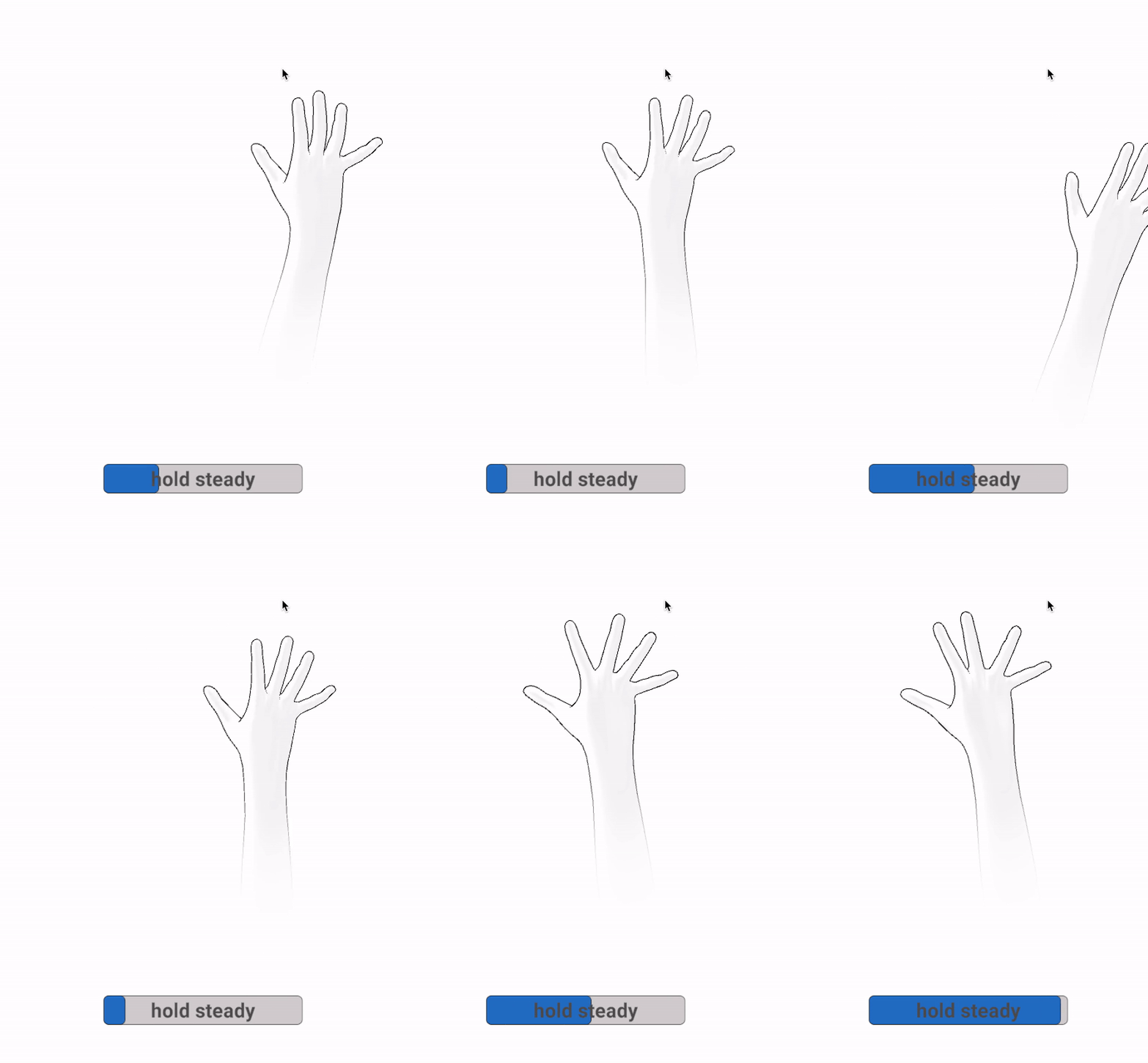
Replaced multiple cues with a 2s detection-loading toggle.
More interactive and straightforward instruction.
DESIGN CHALLENGE 3
HMW make it accessible for users with all abilities?
Patients with varying levels of mobility and cognitive abilities needed a system that accommodated diverse needs. Considering users have hand injuries and disabilities, minimize the interactions is important.
Visual + text + voice instructions
User testing showed that voice instructions (British accent) were particularly helpful.
To enhance clarity, we also added a “beep” before recording and a “ding” when starting a new task—small changes that made a big difference in user experience.
Solution: Hands-Free Interaction
Auto-Advancing Buttons
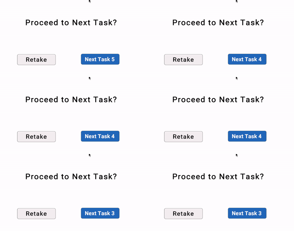
5-second countdown that automatically proceeds if no button is pressed, in case patients struggle with clicking the button.
Solution: Multiple modalities for instructions
Hand detection toggle
The bar only loads when a hand is detected, and it loads for 2 seconds for the recording. This makes the process more intuitive and seamless for users. Built in Unity.
USABILITY TESTING
Testing with the Hand Therapist and Patient
After conducting 3 rounds of user testing with non-target users during development, we finally tested the MVP with actual hand therapists and patients. This was tremendously helpful—we identified key usability issues and made significant improvements. Here are the 2 main changes:
Interactive Hand Maps for Joint Terminology
Patient mentioned they wanted to understand the terms and data better, even though clinicians would explain them.
To address this, I designed and added an interactive map on the data page, allowing patients to visually explore and learn about the specific joints being assessed.
CSV Export for Data Sharing
The data page helped patients track their progress, but during testing, they highlighted the need to export their data.
This would allow them to share results with other clinics and insurance providers—something we hadn’t initially considered.
Arm Rest for Accessibility & Consistency
Testing with an actual patient revealed that people with limited wrist mobility struggled to keep their hands above the camera, making the system inaccessible and data inconsistent. To address this, we added an arm rest, ensuring both usability and reliable data collection.


